Share—
Copied
12 OCTOBER 2023

AIME Studios’ Charlie North and Bauwerk’s Bronwyn Riedel give us a behind-the-scenes peek at The Hoxton x Bauwerk Neighbourhood Collection.
A familiar layered yet accessible aesthetic, underpinned by an obsession with design has always been a brand signature for The Hoxton – a passion seemingly shared by many Hox regulars and neighbours constantly looking for the inside scoop on fabric and furniture sourcing. With every new opening, a fresh influx of messages through email and social channels come, requesting information on fabrics, colours, or pieces of furniture. THIS headboard, THAT side chair, THIS lamp… and even the name of THAT paint colour.
Last month, fans were finally given a chance to recreate those Hox vibes with the launch of The Hoxton x Bauwerk collection, an exclusive line of nine all-natural limewash paints. Inspired by vibrant cities and the colours they evoke, AIME Studios – Ennismore’s in-house design studio and the team behind The Hoxton’s homey and layered spaces – collaborated with Bauwerk to capture the look and feel of four iconic Hoxton destinations: Berlin, Edinburgh, Amsterdam, and Barcelona.
To celebrate the launch, Charlie North, our VP of Interior Design at Ennismore and co-lead of AIME Studios and Bronwyn Riedel, Co-Founder and Creative Director of Bauwerk Colour, recently sat down for an intimate panel talk at The Hoxton Charlottenburg to discuss the collaboration in detail, giving us a behind-the-scenes peek into the design process, from the seed of an idea, and every step along the way.
For every Hox project in the last few years, there is one thing the team keep coming back to – Bauwerk paints. And after years of specifying Bauwerk, it came as a no-brainer to ask them to collaborate on an aspect of design essential to the Hox. “We love it as a product”, says Charlie, “We thought it was an amazing opportunity to ask Bronwyn to work with us and create something that’s pretty iconic to The Hoxton.”
The start of each new Hoxton project for AIME Studios typically begins an intense research process to get to know its new city – a process that fed into the development of the collaboration’s eventual colours.
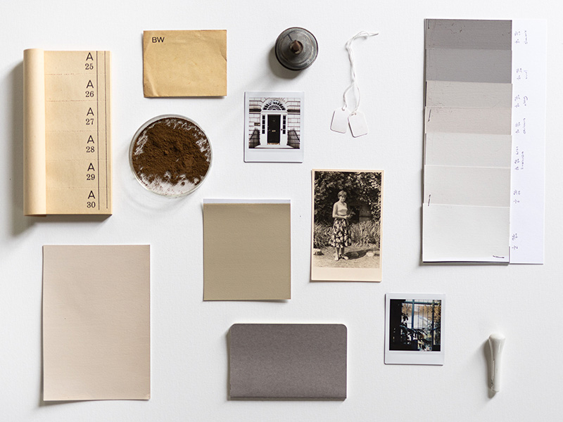
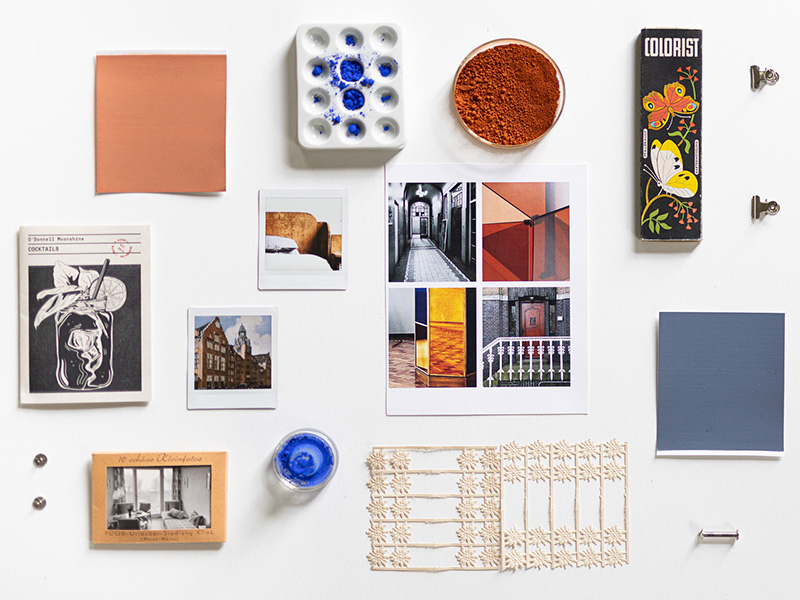
“We would spend at least a couple of weeks doing an intense research period looking at the local neighbourhood, sort of really understanding what should inspire our design decisions,” Charlie explains, “we do a detailed photography deck to sort of get an idea of what kind of colour palates and architecture and we spend a good amount of time understanding what we’re working with so we can do a design that’s different and evolved.”
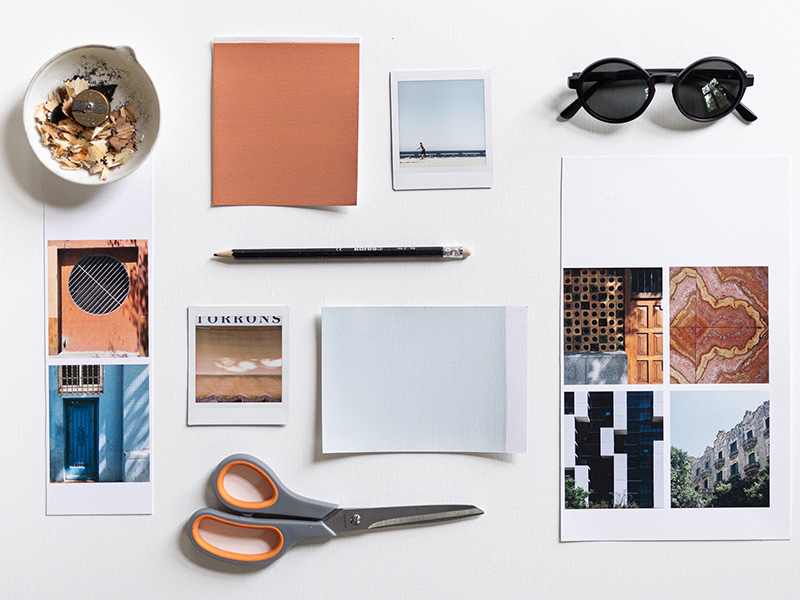
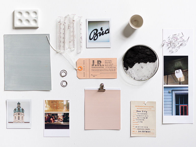
Renowned for its hyper-local approach to design, AIME Studios looked to neighbourhood touchpoints that inspired each hotel’s overarching design narrative when curating the collection.
“We were looking at cities where we had hotels that we were working on the interior design for over the last couple of years, and a few jumped out when we’re talking about like how we can create these colour palettes,” says Charlie, “They were cities that had really strong personalities.”
Bronwyn agrees, “Different stories, different feelings, but also all with a lot of history and patina and interest in the neighbourhoods, which I think goes with the paint well.”
Translating Hox’s vision into a palette of colours, Bauwerk works in the same way an atelier would. “We try them, test them, see the different pigments and then go backwards and forwards with many iterations of colours. So, I probably made 100 colours to come to nine colours,” explains Bronwyn.
The result: A collection captures the look and feel of four iconic Hoxton destinations: Berlin, Edinburgh, Amsterdam and Barcelona, with palettes inspired by the streets and people around each neighbourhood. From the peachy warmth of Barcelona’s seaside streets in Poblenou to the Twenties decadence of Berlin’s Charlottenburg district and more, each shade has been carefully curated in a nod to the character behind some of Europe’s best-loved city areas.
As for designing the rest of your space at home, the two design masters share their final tips.
“We actually always throw in some contrasting things,” says Charlie. Using Charlottenburg as an example, “We’ve got vintage pieces of furniture from the 1930s, 40s and 50s. But then we’ll also throw it next to a contemporary piece that we bought from a local manufacturer or an up-and-coming designer. I think to keep that juxtaposition is important. And I think I’d focus on the final pieces for that rather than making statements like architectural spaces.”
“Trust the process,” concludes Bronwyn.
More Stories


